Accessibility
Presentation
Principles of Universal Design
Universal Design for Learning
Universal Design for Learning, a framework designed by Anne Meyer and David Rose, supports teachers in designing high-quality learning experiences for all learners. While this includes accessible content, it is much more. UDL is designed to support all students, presenting materials in multiple ways, giving students flexibility to interact with the material in the way that works best for them, and provides for different ways for students to express their knowledge. The intent of a UDL classroom is inaccurately summarized as an “IEP for all students”, providing each with the supports and accommodations they need, which can reduce stigma for all students and provide them the tools they need. The core principle of UDL is that “designing for those on the margins improves the experience for all.
The UDL framework recommends providing multiple means of:
- Engagement. Specifically, UDL recommends providing student choice and autonomy in assignments and instructional materials, ensuring that instruction has perceived value and relevance for students and that threats are minimized. UDL also recommends providing options for sustaining student effort including high-salience goals, fostering collaboration and community, and increasing mastery-oriented feedback.
- Representation. In addition to providing accessible content, UDL recommends that content is represented in multiple different means (i.e. video, audio, reading, and graphical), that vocabulary is made clear, that multiple media types are used, and that content is framed in the context of both existing background knowledge and generalizability.
- Action and Expression. In addition to allowing students the flexibility to express their knowledge in different ways, UDL recommends providing students options for fostering executive functioning including supporting goal setting, planning, information management, and progress monitoring.
Legal Requirements for Accessibility
- Section 508 of the Rehabilitation Act of 1973 (Overview)
- Section 504 of the Rehabilitation Act of 1973
- Title II of the Americans with Disabilities Act
- Individuals With Disabilities Education Act
General Accessibility Guidelines
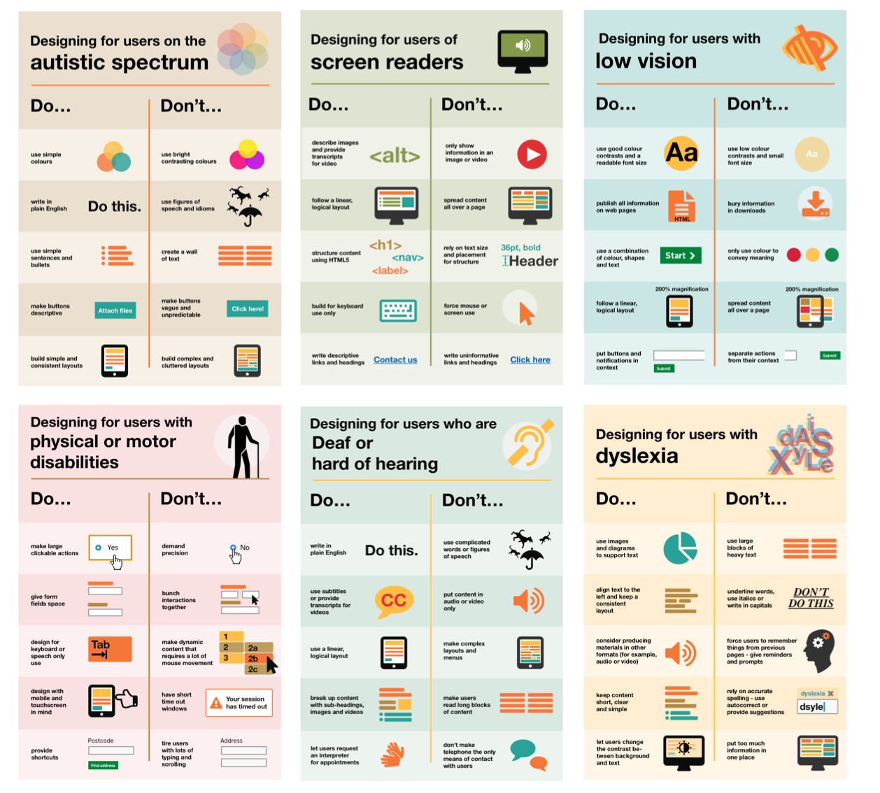 Remember these accessibility guidelines from the U.K. Accessibility Office, including:
- Use clear language and consistent layouts
- Use bullet points and simple sentences
- Avoid bright, busy layouts
- Use readable font sizes and good contrast
- Don’t bury information in downloads
- Use headings, subheadings, and videos
- Spread interactives out over a document
- Camel case your hashtags on social media to improve readability (#camelCaseCapitalizesTheFirstLetterOfEachWord)
Videos and Video Chats
Videos and video chats need two primary supports: captions and accessible visuals.
Captioning
In addition to benefiting d/Deaf and hard of hearing users, captions can benefit users who are who are in noisy environments, users who get distracted and miss a word, and supports users in taking notes. Captions also have tremendous value for users with autism, ADHD, Down’s Syndrome, and English Learners.
Captions should contain the following elements:
- All spoken words from a video call or presentation
- Any relevant background noise (i.e. if someone is speaking in a crowded room, the crowd noise doesn’t have to be transcribed but if a noise (like a school bell) is relevant and adds value to the video, it should be included in the captions in italics and in square brackets.
- Song lyrics in the background should be included in captions as well.
- Speaker indications. If the person speaking is not the person on the screen in italics and parentheses.
- It is not necessary to include words that are already on the screen from a slide or visual aid.
- Video Captioning Style Guide from University of Melbourne
Captions can either be human-generated or machine-generated. Human-generated captions are the gold standard as machine-generated captions are prone to error and have trouble transcribing accents and sounds over a video conference or from noisy environments. Human-generated captions, however, are time consuming to create and services to create them can be expensive. Students do have a right to request human-generated transcriptions. In live meetings, you have a few options for generating live captions:
- Human-Generated Captions
- Zoom has built-in functionality to type captions in the meeting. A person can be assigned to type captions live in a meeting.
- Companies exist that will provide this as a service. NC State has convenience contracts for live captioning.
- Machine-Generated Captions
- Otter.ai will generate a transcript page for a meeting in Zoom live. The transcript will be in a separate window.
- Google Meet has live support for closed captioning.
- Google Slides and Microsoft PowerPoint have built-in caption support. These captions are limited as they will not display if you switch applications away from the slide deck, and have trouble recognizing other speakers on the Zoom call. Additionally, because they’re embedded in the slide show, they’re “burned in” to the recording and cannot be removed. This may create issues for you later if you want to add human-generated captions to a recording.
- Using Open Broadcaster Software (OBS), and a website called WebCaptioner, it is possible to add a caption window to your webcam image, and use this as a camera in Zoom or Google Meet. Like PowerPoint and Google Slides, these captions only recognize the speaker on one computer and are “burned in” to the recording.
In a pre-made video or a meeting recording, captions are a bit easier:
- Machine-Generated Captions
- Zoom will automatically create a webpage with captions for cloud recordings, if enabled.
- When uploading a video to YouTube, YouTube will automatically create captions within a few hours after upload.
- Human-Generated Captions
- Rev.com offers a service that will transcribe video and audio files for you. Rev.com can automatically push corrected captions to YouTube.
- Automatic captions in YouTube can be corrected to be more accurate. If a video is kept unlisted or private, you can keep it from being discoverable while enabling these features.
Accessible Visuals
Keep in mind that the PowerPoints and other materials shared on screen sharing during a Zoom call, or embedded in a video, are not accessible. It’s recommended that you share slide decks with users ahead of time and share the link in the chat so that users can access them. If you share your screen during a presentation, narrate your actions so that someone can recreate them. If necessary, you may need to create an audio description track to narrate actions separate from the main video.
Fonts
The use of fonts should be kept to a minimum number of easily-readable fonts. 12 point minimum is recommended on documents. 14 point minimum is now recommended on websites, and 18 point font is recommended on slides. Use the WebAIM contrast checker to ensure that sufficient contrast exists between your text and your background at the font size you are using.
Images
In presentations, reports, and web pages, images need to be annotated with alternative text (also called an alt-tag) that describes the content of the image. This allows users who can’t access the image (due to a visual impairment, low bandwidth connection, etc.) to understand the contents. Alternative text must be used for every image in a document unless the image is purely decorative and serves no functional purpose in the document. Alt text should also describe the contents of the image, and not the image itself. Consider the example below. Using alt-text of “The water cycle” for this image is inadequate because it does not describe the contents of the image. You would need to use a describe tag such as “The water cycle: the process by which water in the oceans evaporates, condenses to form clouds, falls to the ground as rain, and is again collected in the ocean.” The content of an image should also be reflected in a document. For example, a graph can be alt-tagged, but the description of the key findings (and ideally, a data table) should be included in a document. For complicated charts, it is acceptable to reference the discussion section of a paper if the information conveyed there will explain the chart. Alt tags are added differently in different applications. In Moodle, there is an alt-text field when adding an image. In Office and Google Docs, you can right-click on an image to add the alt text. You can also add alt-text on Twitter, Facebook, and Instagram.

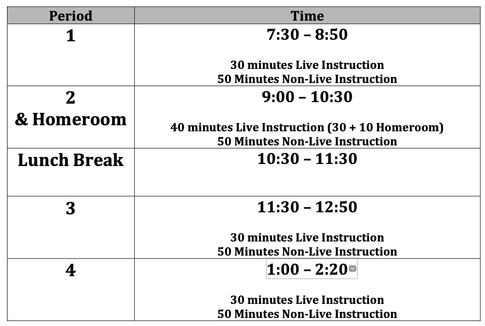
In addition, it is a best practice to avoid images that are all text, and creating these elements as text instead. Consider the example below. Instead of using an HTML table, this school posted an image of their bell schedule. However, because the text is contained within the image, it is unable to be read by screen readers or translation software.
File Sizes
Images embedded into documents and websites should be no larger than they need to be to maintain the needed level of detail. For example, a smartphone camera will likely take an image that is a 2MB image with dimensions of 14” x 9”. Many smartphone cameras can take much larger, much higher resolution images. These large files can use data from those with limited connections. Keep images to 500KB on websites unless absolutely necessary.
Use of Color, Charts and Graphs
In addition to creating accessible images, the use of color in resources creates accessibility issues as well. To support those with color blindness and other visual impairments, foreground and background colors in documents should always be high-contrast. The WebAIM Contrast Checker can tell you based on the font size if a foreground and background color are high enough contrast.
In a chart, each visual element should also contrast sufficiently. For example, in a bar graph, each bar should be sufficient contrast from each other bar (see this guide from Penn State). In addition, color should not be the only indicator of information. For example, labeling your axes, using shedding patters, etc. to differentiate between data points.
You should use captions to title a figure (in a way that’s tied to the table). In Word you can right-click on images to add a caption (this functionality is not available in Google Docs). In HTML, use this syntax around your image:
<figure>
	<img src="image.jpg" alt="Image Alt Text">
	<figcaption>Figure caption</figcaption>
</figure>
Headings
Screen readers, table of contents tools, and keyboard navigation use headings to navigate the screen. In addition to using proper heading styling, headings should be nested such that Level 1, Level 2, Level 3 headings, etc. do not appear out of order. Level 2 headings should only appear under level 1 headings, and Level 3 headings should only appear under Level 2 headings. Additionally, it’s recommended that on web pages, there is only one Level 1 heading - the page title. While this isn’t a requirement, there should be at least one level one heading on each page and it generally works out that the page title as a Level 1 Heading and using Level 2 throughout the rest of the page is the easiest approach (as on this page).
Hyperlinks
Many screen readers will allow users to navigate links on a web page as a list. For users with motor disabilities, an accessible website allows for navigation using only the tab and arrow keys to move between links (and the Enter key to select them). Additionally, to simplify the user experience, links should be descriptive and should help the user figure out where they will be linking to. Avoid making the link the word “here” and avoid using the same words for multiple links in a document.
For example: Learn more about the Friday Institute by clicking here, here, and here.
From this sentence, it’s not clear what users will be learning about when they click on the link. Secondarily, on phone screens, the words “here” are too close together and may not make a large enough tap target for someone with limited dexterity to click on. Instead, word links descriptively, like: Learn more about the Friday Institute, our mission, our projects, and our people.
Additionally, since some users may not be aware of changes in the active window, it is a best practice to inform users when the link they click on will open in a new tab. Some websites add the text “(opens in a new tab)” to the link text. Others use an icon and include ARIA tags to inform users that their site will open in a new window.
Tables
Tables with a designated header row and column should have columns designated as such so that screen readers and other format converters will read the header information with the cell data, and so that headers will be shown on each printed page.
In HTML, this is done as follows:
<table>
	<caption>Table Title</caption> <!--Table Title-->
	<thead> <!--Table Header-->
		<tr> <!--start header row-->
			<th> <!--use th instead of td to designate a table header-->
				Table Header 1
			</th>
			<th>
				Table Header 2
			</th>
		</tr>
	</thead>
	<tbody> <!--Begin the body of the table-->
		<tr>
			<th><!--Use th for a header column-->
				Header Column
			</th>
			<td><!--Use td for table data-->
				Table Data
			</td>
		</tr>
	</tbody>
</table>
In Microsoft Word, you can designate a table header row, as well as add alt text for a table. For Microsoft Excel, you can create named regions to designate a table. Additionally, you should use captions to title a table so that users know the title of a table (in a way that’s tied to the table). In Word and Google Docs, you can right-click on tables to add a title. In HTML, use the <caption> tag inside your table tag to add a title.
Microsoft Office and Google Drive
Whether in webpages or in documents, many of the same accessibility rules above apply - images should have alt text, table rows should be labeled, etc. In addition, you should use semantic styling in all documents, including Word Docs, Google Docs, and HTML files. Semantic styling involves identifying elements in a document by what they are, rather than how they look. Whereas typically, to designate a header in Google Docs, you might simply bold the text, when styling semantically, you would use the styles pane to designate an element as a header, and then style the header through the styles pane.
PowerPoint has a number of accessibility features (beyond alt text and the other items discussed). Specifically, you’ll want to make sure that you use named regions on your slides (title text, subtitle text, body text, etc.) as intended and set a reading order for your slides to ensure that a screen reader would read items in the correct sequence.
Accessibility Checking
Microsoft Office features a built-in accessibility checker across all Office apps. This tool will check accessibility features in your document
Google Docs does not have a tool like this built in. However, the Grackle Docs extension does this in Google Docs.
Voice Typing and Reading Support Tools
You can type with your voice In both Google Docs and Microsoft Office which is helpful for students with motor disabilities. Additionally, Microsoft Word will provide readability statistics, and has a built in reading support tool called Immersive Reader.
PDF Files
PDFs are among the most difficult format types to make accessible, especially using Acrobat’s built-in tools. The best practices are to design in Word, and then export to PDF. Confirm accessibility in Word before exporting. Additionally, it is recommended to make documents available in another format.
Documents that are scanned to PDF are not accessible. The University of Arizona has a good primer on PDF accessibility.
Websites and Web-Based Applications
When designing a web page, consider all of the elements above, and use that to create proper, semantically-styled HTML5. While many built-in editors in content management systems like Moodle and WordPress will do a good job on their own, they may not be perfect and some manual code editing is sometimes (though rarely) required. The WAVE tool will check accessibility for a website against the Web Content Accessibility (WCAG) Guidelines. The current version of WCAG guidelines is version 2.1. WCAG is based on a three-tier system from single-A to triple-A (AAA). WCAG-2.1-A guidelines are the least strict (and the most minimally accessible) while WCAG-2.1-AAA is the most strict. NC State policy requires compliance with WCAG-2.1-AA.
One particular element of WCAG-2.1-AA is navigation. For users using assistive or adaptive devices who may not be able to use a mouse, they should be able to navigate a website using only arrow keys (including Page-Up and Page-Down), the tab key to move between links, and the Enter key to select a link.
Commercial web applications using a Voluntary Product Accessibility Template (VPAT) to indicate their compliance with WCAG or Section 508 standards.